The Letter A
The Letter A

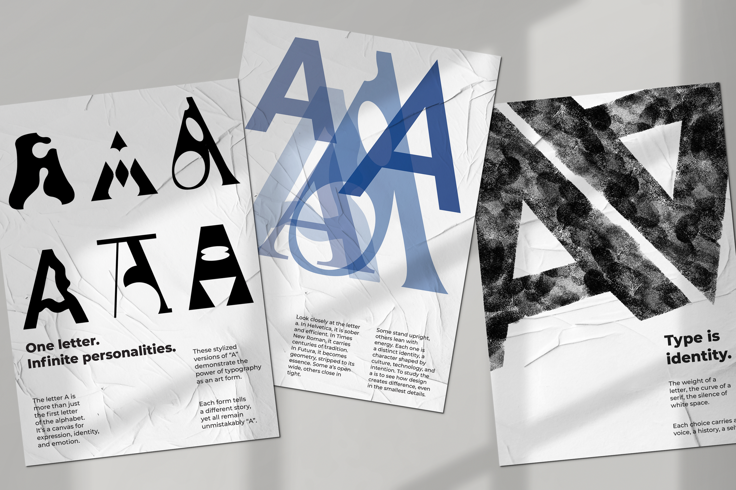
A Series of Experimental Exercices
This is a series I started in my second year graphic design class. We had to explore a letter in the alphabet and experiment with it. This project was to help us sharpen our conceptual thinking in graphic design, typography and composition. I made experimental posters with each of the A’s being designed by me. Apart from the three letters on one poster that were made with the fonts “Helvetica, Times New Roman, and Futura.
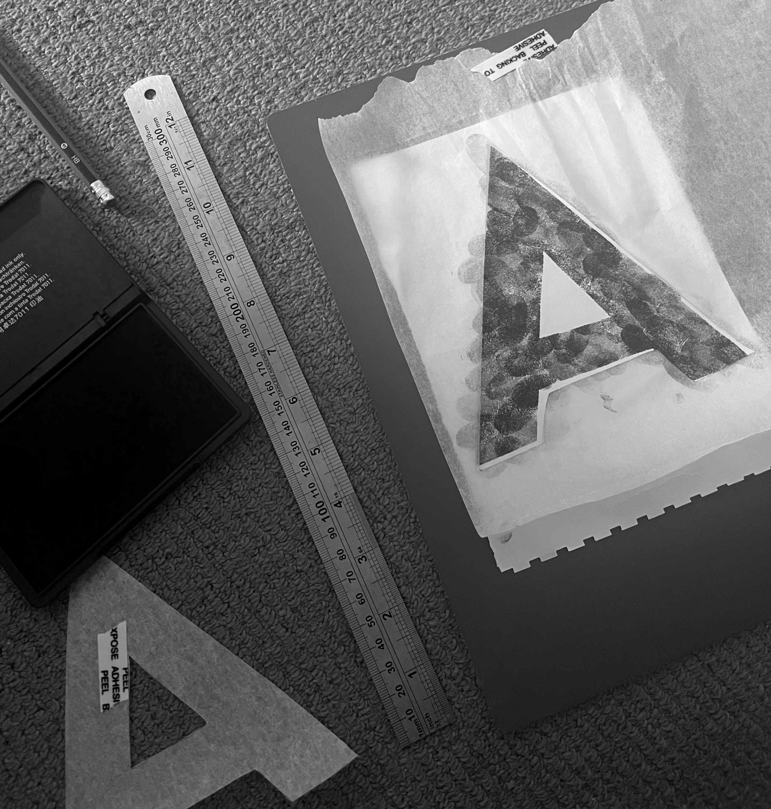
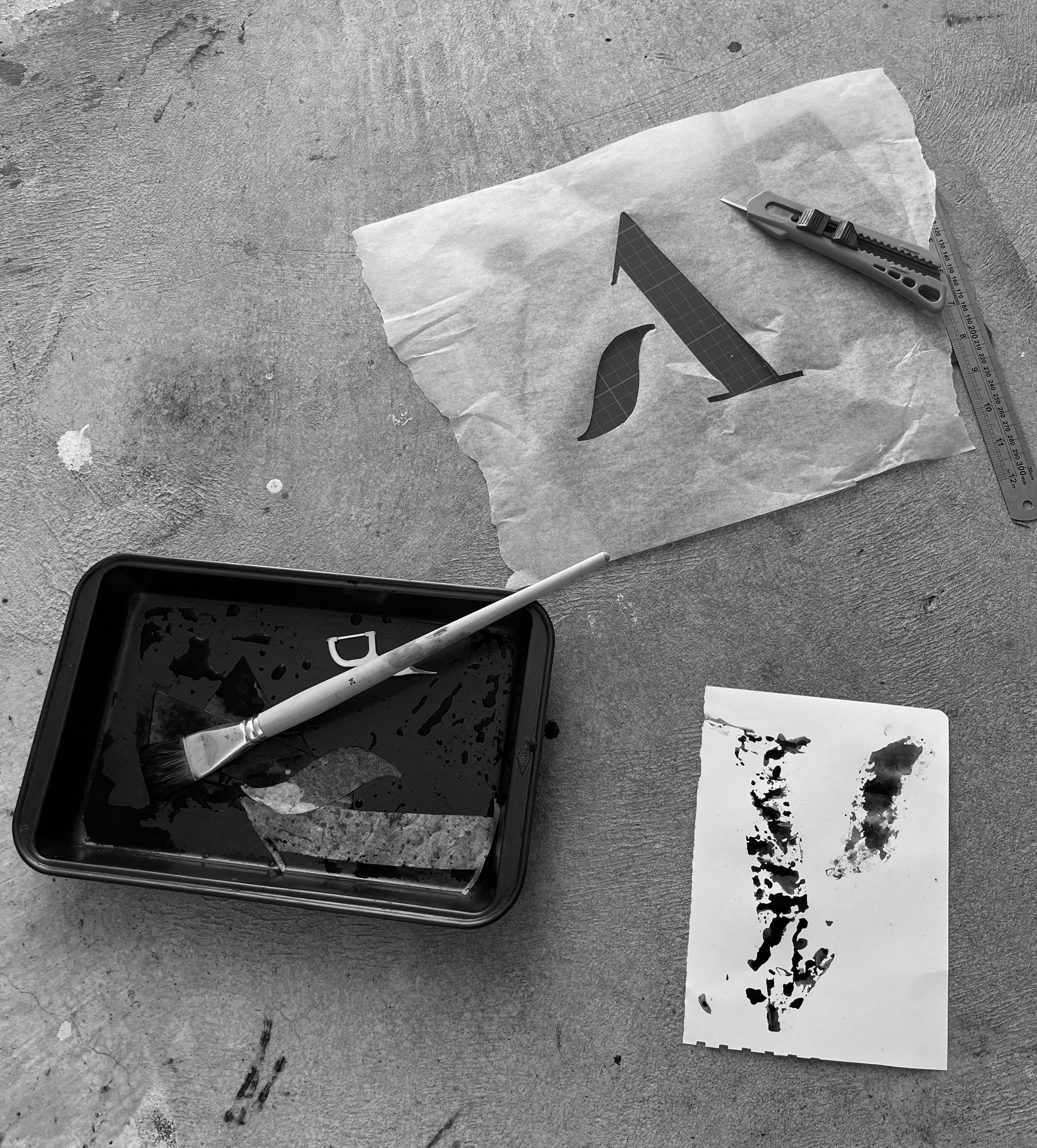
I loved doing this project because it helped me to think outside the box and get my hands dirty. I added some pictures of the process and some BTS footage. I made stencils out of baking paper and used a glue stick lid to make a pattern.
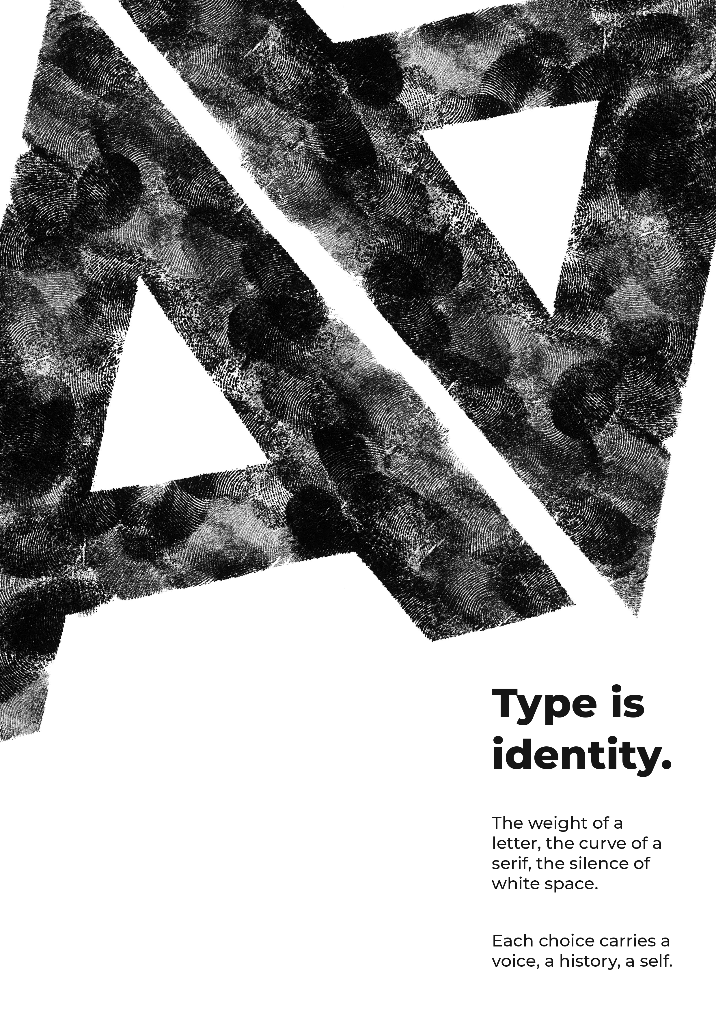
The final compositions embrace their imperfections, the smudges outside the stencil, the varied pressure of a fingertip. As testaments to their handcrafted origin. This series is a celebration of the raw, the tangible, and the beautifully imperfect side of typography.
#HandLettering #Typography #SketchbookWork #Posterdesign
-
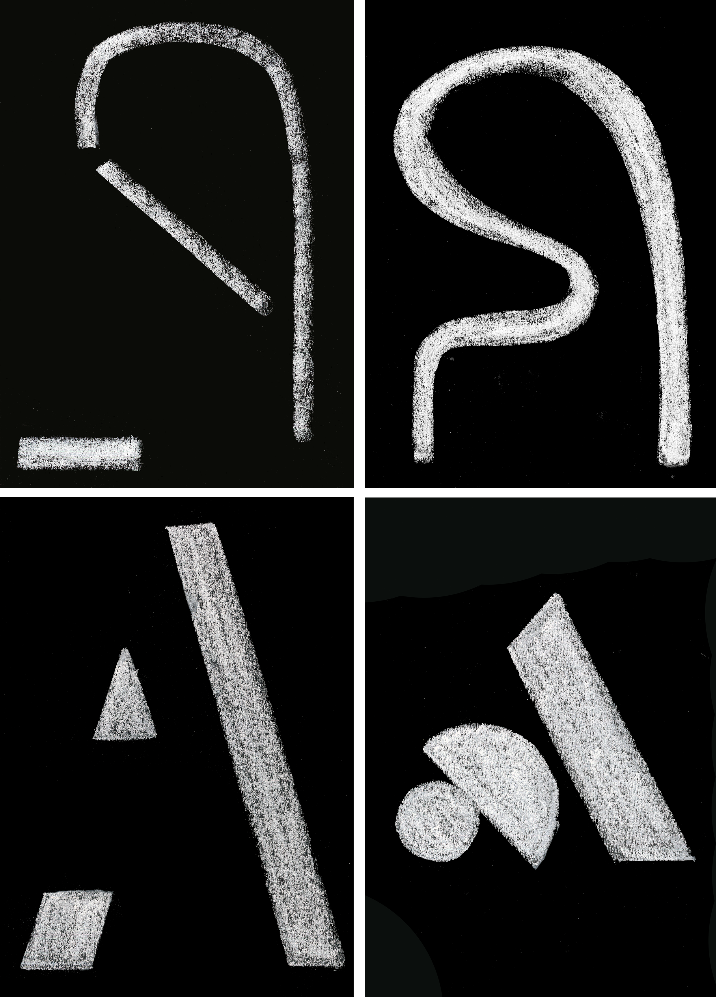
Materials used: Charcoal, Pastels, Ink (fingerprints), Paint, markers.
The Font used for the posters was Montserrat
The Process
This piece explores the individuality of mark-making through a hands-on process. I began by inking my own fingerprint, then layering it with stencils cut from baking paper to create unique patterns and textures.
To develop the composition further, I incorporated chalk, repeating the letter “A” as a typographic element. The combination of personal, organic prints and structured letterforms highlights the balance between identity, experimentation, and design
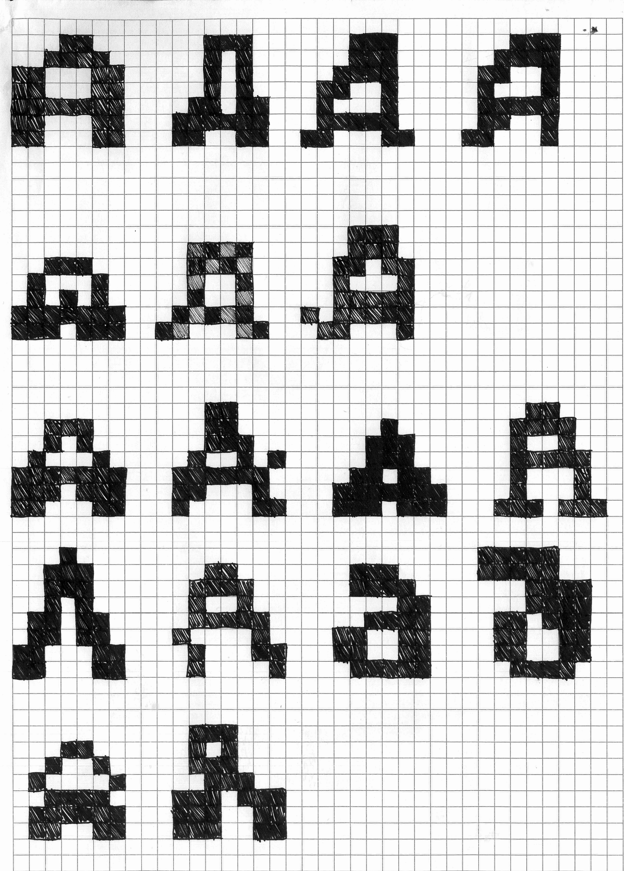
I also made alot of A’s using a grid system all of them were handrawn by myself.